75 Greatest Movie Cover Designs
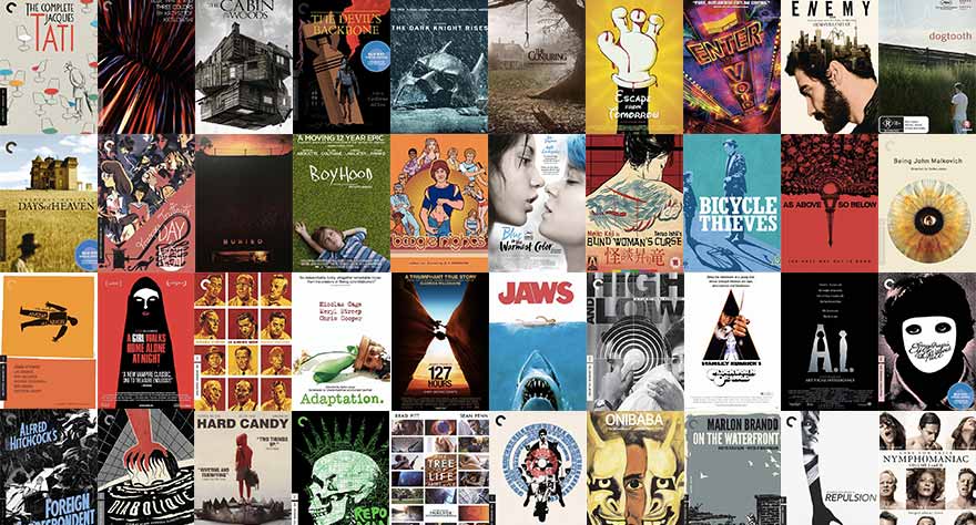
They say you can’t judge a book by its cover. But what about movies? We’re huge fans of well-designed movie covers here at Way Too Indie, and while we wouldn’t say the design impacts our overall judgment of the film, we admit a good design may influence us to watch it in the first place. So we created a list of the 75 Greatest Movie Cover Designs of all-time, comprised of new and old titles, special edition releases, and from boutique distributors like the Criterion Collection (clearly our favorite, earning 34 spots on this list).
12 Angry Men (Criterion Collection)
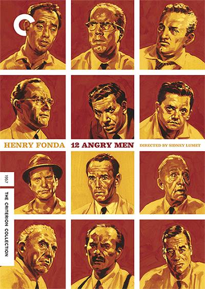
Brilliant design with 12 hand-drawn portraits of the jury featured in this essential courtroom drama, each with red backgrounds except for the one in the middle, which represents Henry Fonda as the man who stands out from the group with his own opinion. [DJ]
127 Hours
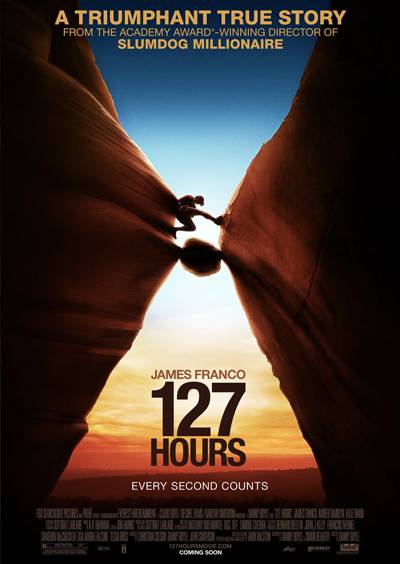
It may not be immediately obvious, but the sides of the canyon form an hourglass timer and the setting sun looks like sand. Very fitting with the tagline of the film, “Every second counts.” [DJ]
A Clockwork Orange
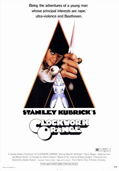
Simply an iconic poster with minimal design that somehow makes the ’70s block font used on the title tolerable. [DJ]
A Girl Walks Home Alone at Night
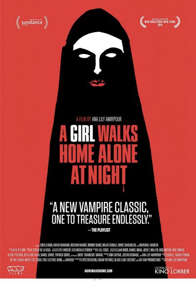
A Girl Walks Home Alone at Night is an eerie, experimental film, so it’s only fitting that its home video release includes eerie, experimental cover art. [BH]
Adaptation
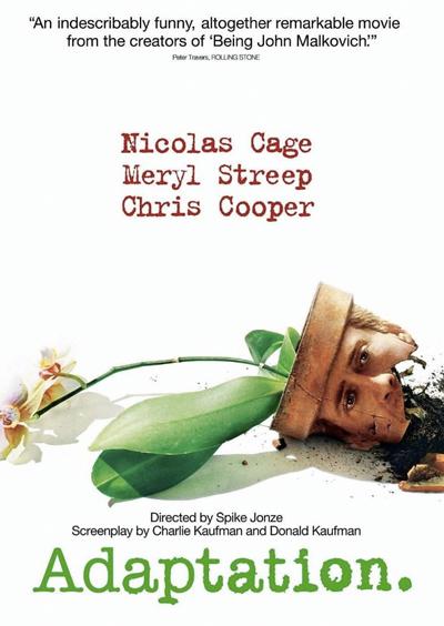
A funny little image that hints at the madness of Charlie Kaufman and Spike Jonze’s hilarious and painful world. [RS]
Almost Famous (Special Edition)
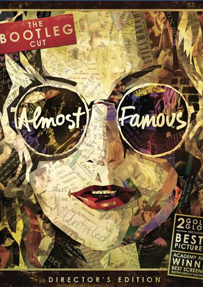
Cameron Crowe’s magnum opus gets a fantastically ornate and fun cover for its Bootleg Cut. Have a magnifying glass handy. [NG]
Anatomy of a Murder (Criterion Collection)
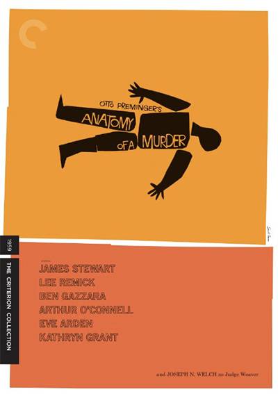
The first of several Saul Bass designs on this list. This striking design is such a classic that Spike Lee essentially stole the design for his 1995 film Clockers. [DJ]
Artificial Intelligence

Using the kid from the film as the ‘i’ in Intelligence and then inversing him to form the ‘a’ in Artificial is a simple, yet clever design. [DJ]
As Above, So Below
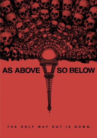
The design fits the title of the film so perfectly. [DJ]
Being John Malkovich (Criterion Collection)
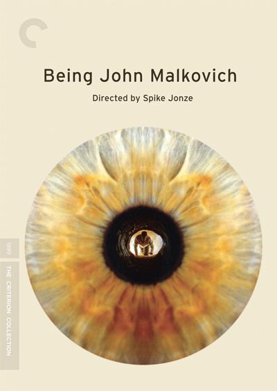
There’s more brilliance than meets the eye in this simple Criterion cover of Being John Malkovich, perfectly suiting the eccentric nuances of the film. [NG]
Bicycle Thieves (Arrow)
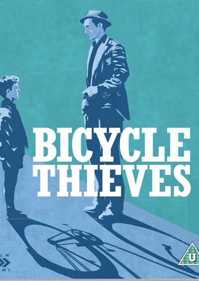
The shadow from the two main characters form a bicycle. Great use of…foreshadowing.[DJ]
Blade Runner (Steelbook)
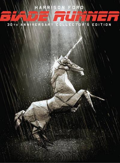
The rainy spotlight shines on the origami in this gorgeous Blade Runner Blu-Ray steelbook, evoking the pulpy, mysterious mood of the classic sci-fi noir. [NG]
Blind Woman’s Curse (Arrow)

The original Girl with the Dragon Tattoo. Through beautiful design, Teruo Ishii’s exploitation classic practically jumps off the cover. [NG]
Blue Is the Warmest Color
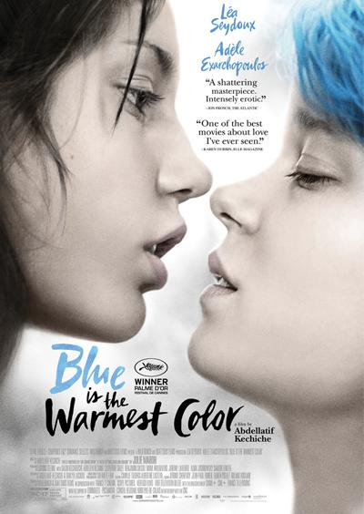
Simple but gorgeous artwork which plays off the color from the film’s title. [DJ]
Boogie Nights
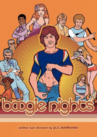
Simply a beautiful retro design on the special edition release of this masterpiece. [RS]
Boyhood
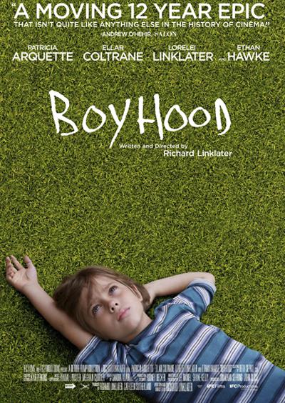
The contrast from the grass provides excellent contrast for the title. Plus, it wonderfully represents the dreamlike ideology of boyhood. [DJ]
Buried (Steelbook)

This cover explains the entire premise of the film; a man buried under ground and trapped inside a box. [DJ]
The Cabin in the Woods
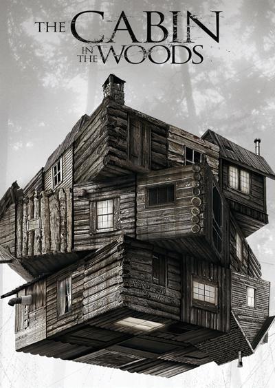
The cabin pictured in the design looks almost like an Rubik’s cube, hinting at the puzzling plot found in the film. [DJ]
The Complete Jacques Tati (Criterion Collection)
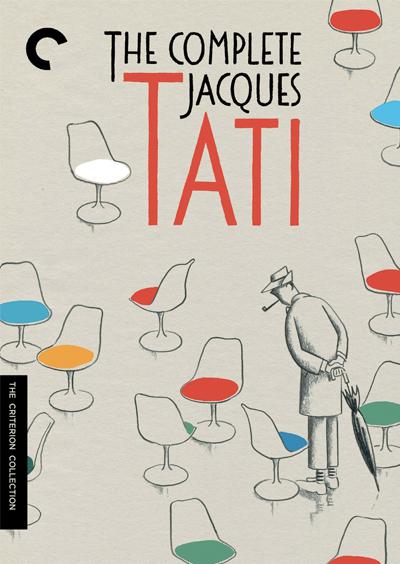
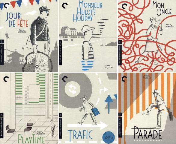
Might be the best on the list because it doesn’t just come with one spectacular looking design cover, it’s a collection of several beautiful illustrated covers in one package. [DJ]
The Conjuring
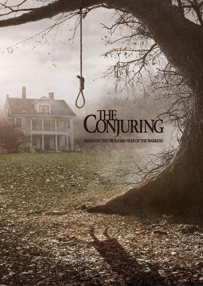
At first glance it looks like an ordinary horror film cover, until you notice the shadow near the bottom. [DJ]
The Dark Knight Rises (Steelbook)
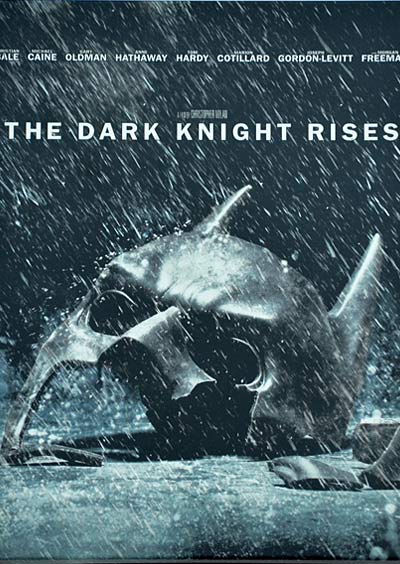
The broken mask and heavy rain combine for one dramatic looking design. [DJ]
The Devil’s Backbone (Criterion Collection)
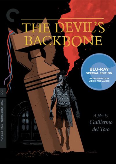
There’s very little ambiguity in Criterion’s cover design for The Devil’s Backbone. A wartime horror film dealing with the paranormal receives artwork that seamlessly bridges the gap between those two subjects. It’s impressive, to say the least. [BH]
Day For Night (Criterion Collection)
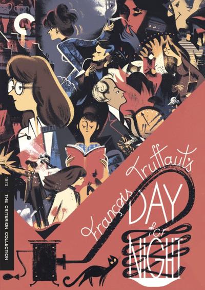
Francois Truffaut’s masterpiece is a love letter to the beautifully chaotic nature of making a movie, and Criterion’s cover art for the film perfectly encapsulates the vibe of Day for Night. [BH]
Days of Heaven (Criterion Collection)
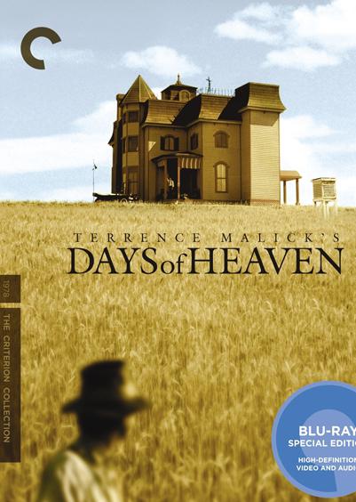
I love how sharply in focus and imposing the house is in relation to Gere’s fuzzy appearance in the foreground. [BB]
Dogtooth
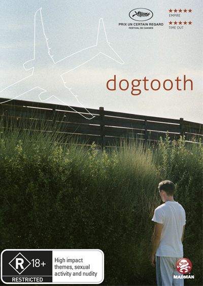
A man staring at grass infront of a fence accurately sums up the absurd censorship portrayed in the film. And after you’ve seen the film the airplane makes a lot of sense too. [DJ]
Diabolique (Criterion Collection)
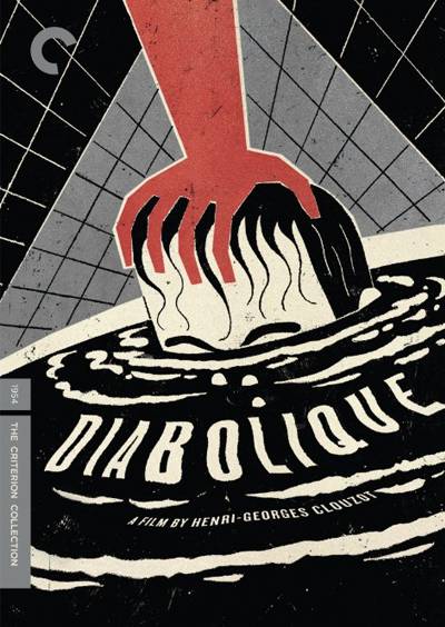
A dazzling illustration of a key scene in this French thriller. The rippling water effect on the typeface is a brilliant touch. [DJ]
Dressed To Kill (Criterion Collection)

A wonderful composition equal parts suggestive and creepy, totally befitting De Palma as a master of erotic thrillers. [RS]
Drive (Steelbook)
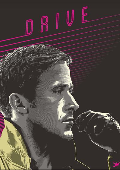
This Steelbook cover has rad ’80s flair thanks to hot pink lettering and the neon sign looking design. [DJ]
Enemy
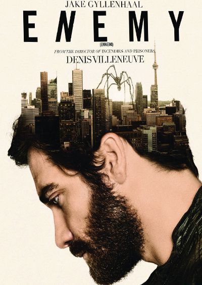
The Toronto skyline transposed over Jake Gyllenhaal’s head signifies the brain-teasing doppelganger story found in the film. [DJ]
Enter the Void
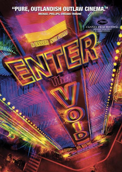
Bright neon colors. Overstimulated visuals. Odd angles. The cover design perfectly matches the film. [DJ]
Escape From Tomorrow
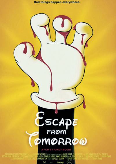
The easy to recognize drawing of a certain iconic Disney character covered in blood captures the frightening twist this film has of the “happiest place on earth”. [DJ]
Eyes Without A Face (Criterion Collection)
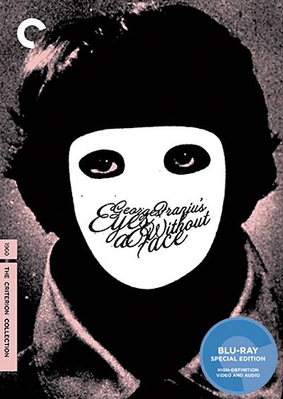
Those eyes!! Edith Scob’s piercing gaze is captured in haunting fashion by Criterion’s designers here, made all the more striking by its ingenious choice of white as facelessness. [NG]
Foreign Correspondent (Criterion Collection)
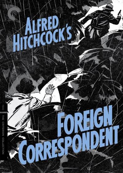
The vibrant Criterion cover, with its 3D-like rain and sea of murky umbrellas, elevates one of Alfred Hitchcock’s lesser-known films to must-own status. Watch the behind the curtains video for this particular design. [NG]
The Game (Criterion Collection)
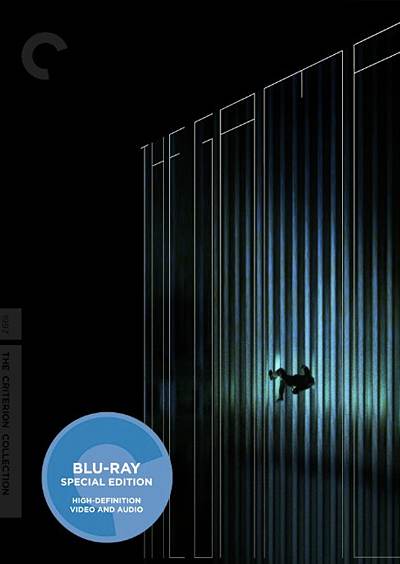
A brilliant design for a film about a man brought to the edge by both temptation and the illusory structure of society finally forgets his weight and allows gravity to pull him downward. [EH]
Hard Candy
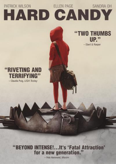
The bright red hoodie draws your focus in like a target, and the trap fits well with the cat and mouse theme in the film. [DJ]
High and Low (Criterion Collection)
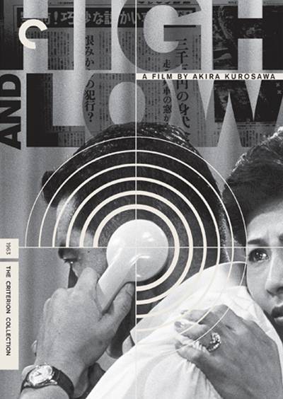
Perfect use of the epicenter motif that couldn’t be paired with a better image from the film. [BB]
House (Criterion Collection)
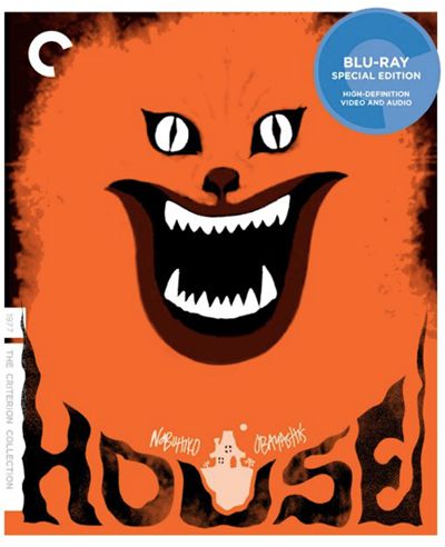
Those eyes just don’t leave you. It’s a fiery and startling image that you can’t help but pause to take a second look at while browsing through the DVD racks. [BB]
The Human Condition (Criterion Collection)
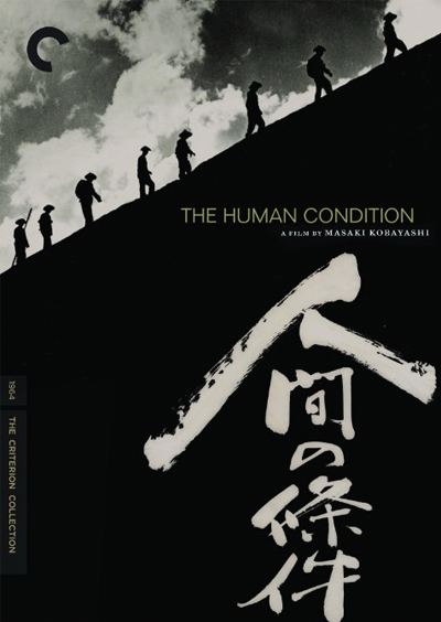
A simple design but not one without the kind of quiet power that characterizes Kobayashi’s work. [BB]
Jaws
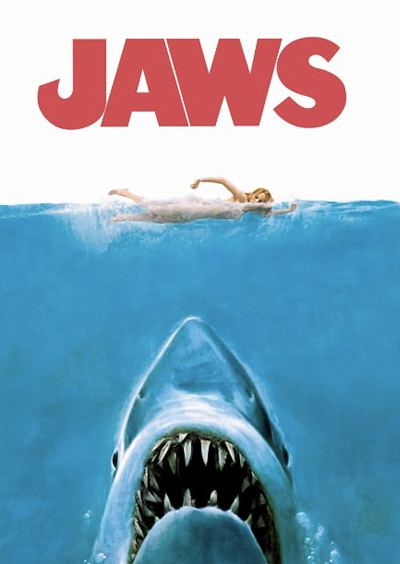
I was tempted to write nothing here, quite possibly the most iconic cover in all of film it pretty much speaks for itself. [RS]
Jurassic Park
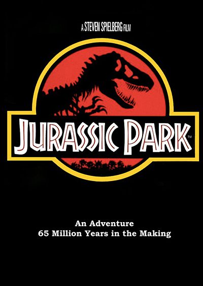
The iconic logo (which is used all over in the film) helped make this design an instant classic. [DJ]
The Lobster
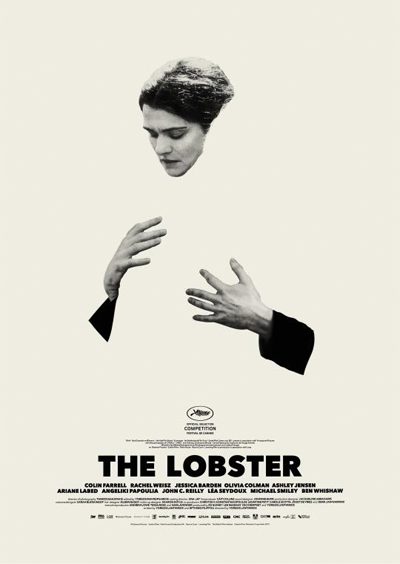
Technically, this is a poster design for a film that hasn’t been properly released yet, but we’re including it anyways. Fantastic use of negative space. [DJ]
Lord Of War
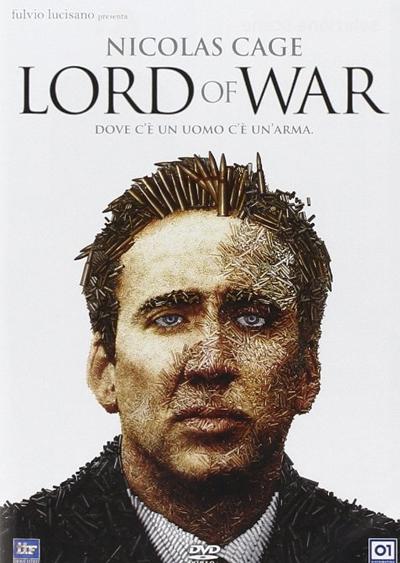
Nicolas Cage’s face made out of bullets is exactly what the world needs. [DJ]
Make Way For Tomorrow (Criterion Collection)
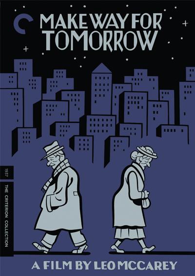
Wonderfully represents two companions forced apart by circumstances out of their control, drifting gradually but surely down separate, melancholic paths. [EH]
Medium Cool (Criterion Collection)
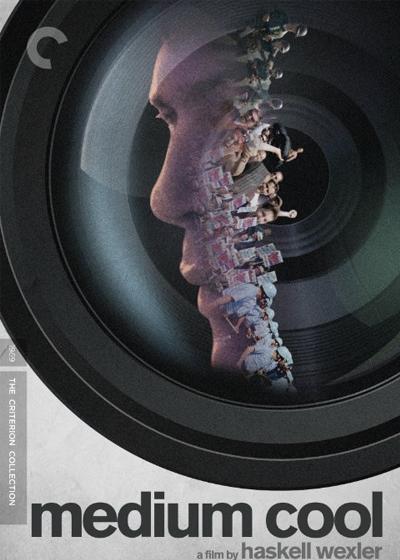
A tremendously striking image from the juxtaposition of its colors to the image-within-an-image design. [BB]
Melancholia (Plain Archive)
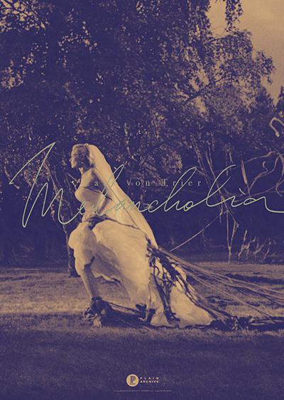
Great contrast between the sepia tone still from the film and the turquoise script lettering of the title. [DJ]
Memento (Special Edition)
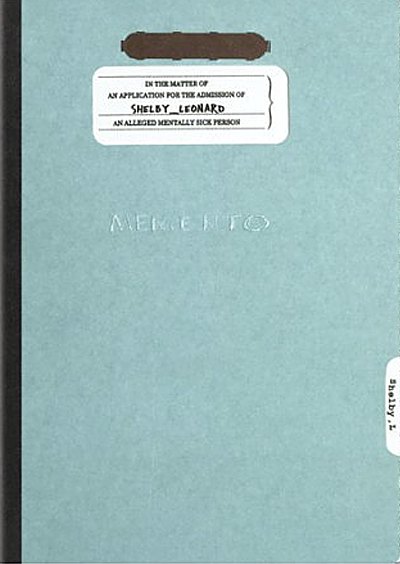
Nothing fancy here. Just pure, unfiltered, genius. Presenting Memento in the form Leonard’s case file will put an insta-smile on every fan, while enticing anyone who hasn’t seen the film to peek inside and get their minds blown. [NG]
Mishima: A Life in Four Chapters (Criterion Collection)
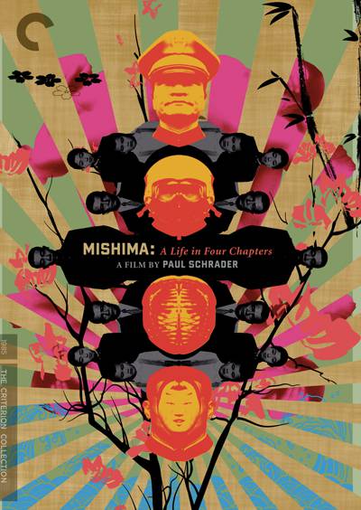
A fittingly flamboyant explosion of color and a gorgeous application of the mirroring effect. [BB]
Moonrise Kingdom (Criterion Collection)
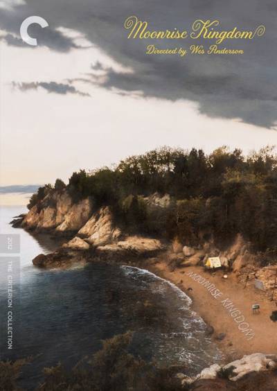
The latest Wes Anderson on Criterion is one of his very best films, aptly honored by one of Criterion’s most epic and intricate designs. [NG]
Network (Arrow)
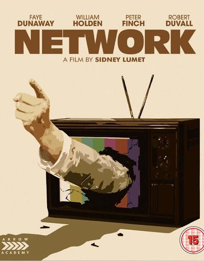
A wonderful rendering of a rouge news anchor ‘telling it how it is’ on air, with the finger-pointing arm coming out of the TV set. [DJ]
Nymphomaniac (Vol. 1 and 2)
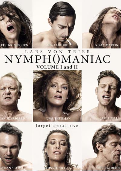
The whole marketing campagin behind the film was very on point, and so is this cover design featuring nine characters mid-orgasm. [DJ]
On The Waterfront (Criterion Collection)
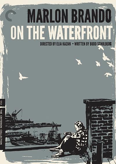
This screen print looking design is splendid, especially with the inclusion of the birds, which are a major theme in the film. [DJ]
Onibaba (Eureka)
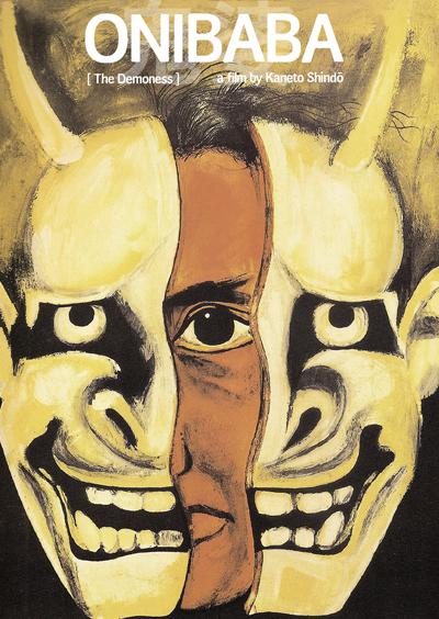
This formidable Masters Of Cinema cover, alluding to the dementia in Shindo’s classic ghost tale, does Criterion one better! [NG]
Quadrophenia (Criterion Collection)
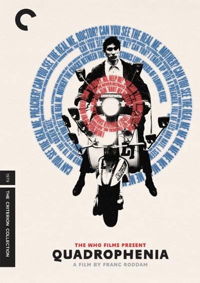
The choice to color and arrange The Who lyrics in a way that replicates the band’s logo and circles the film’s main character is simply awesome. [BB]
The Raid (UK Steelbook)
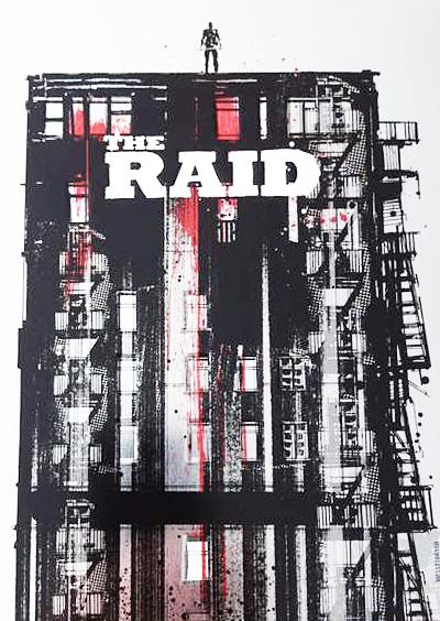
One of the best-looking steelbook designs around, the picture on this cover of The Raid paints a thousand words of glorious violence. [NG]
Repo Man (Criterion Collection)
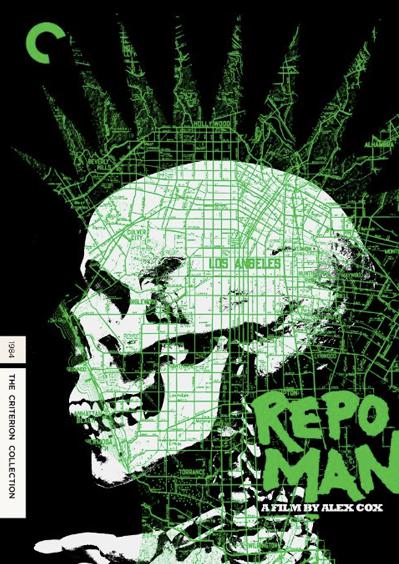
It makes perfect sense for a decidedly West Coast punk rock film to receive a punk rock artwork over a map of Los Angeles. It’s a bit surprising that Criterion is the distributor to make that happen, but they have done a fantastic job. [BH]
Repulsion (Criterion Collection)

This Criterion cover recalls the broken nerves and intense paranoia of Roman Polanski’s classic apartment horror in loud and disorienting whiteness. [NG]
Scanners (Criterion Collection)
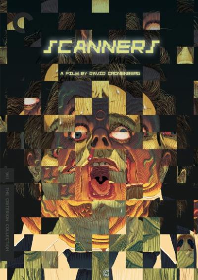
Criterion’s cover design for one of Cronenberg’s most beloved films features a different kind of head explosion, but it’s extremely clever nonetheless. [BH]
Seconds (Criterion Collection)
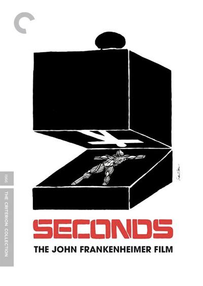
A strange and interesting design that draws me in every time I come across it. [RS]
The Secret of the Grain (Criterion Collection)
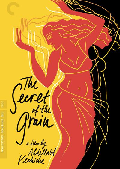
Hands held high in the air but eyes facing the Earth and a disparity of light and darkness on either side: will the story end in glory or tragedy? [EH]
The Shining
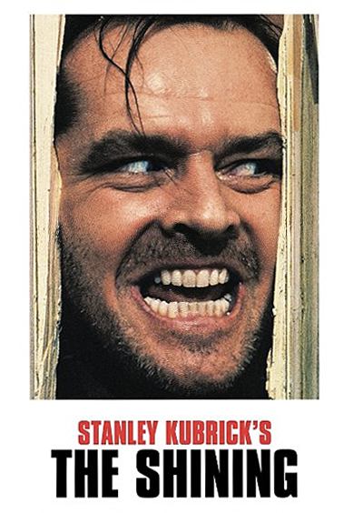
Saul Bass designed equally amazing the yellow theatrical release poster, but the actual cover used for the home release of the film is great too. Very Kubrickian. [DJ]
Submarine
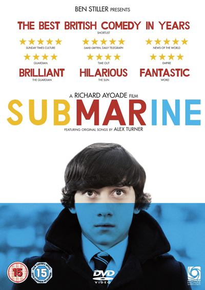
Using a white background allows the colorful text and images to really stand out. Great example of a clean design. [DJ]
The Sweet Smell of Success (Criterion Collection)
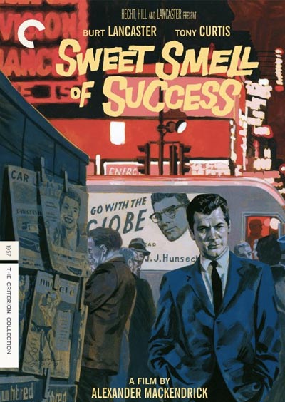
It’s rare for DVD art to double as something that could easily be hung on the wall and admired. This is one of those rarities. [BB]
Talk To Her
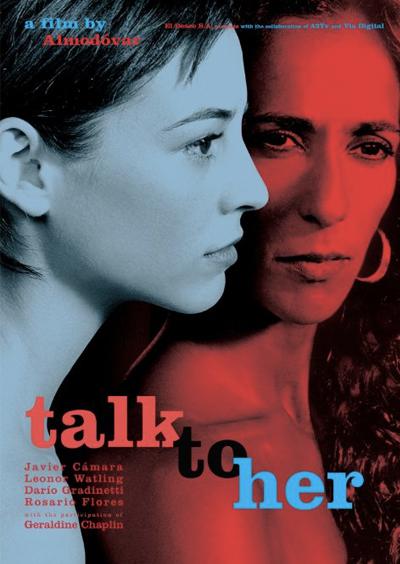
Like the film itself, shows a wonderful use of color and Pedro Almodovar’s great imagery. [RS]
The Thing
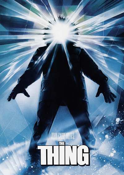
Never fails to capture my attention. I always end up watching the film if I stare at this cover too long, usually only takes a minute or so. [RS]
Three Colors Trilogy (Criterion Collection)
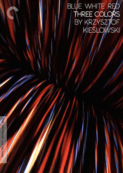
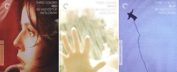
Criterion borrows one the most emblematic shots from Kieslowski’s indelible Trilogy for this spectacular mixture of red, white, and blue. [NG]
Trance
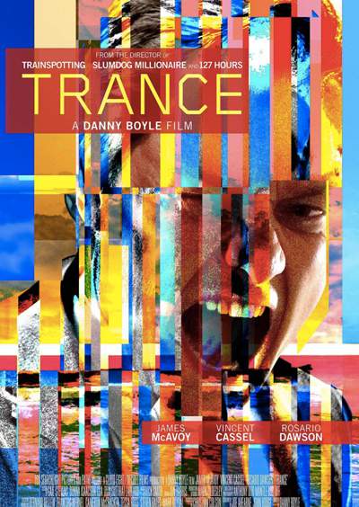
A chatoic arrangement of shapes, colors, and an image of a man screaming. As the title suggests, it puts you in a trance. [DJ]
The Tree of Life
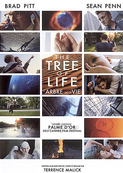
Gorgeous snapshots of life are found throughout the film, so it’s fitting that the cover contains a bunch as well. [DJ]
Under the Skin
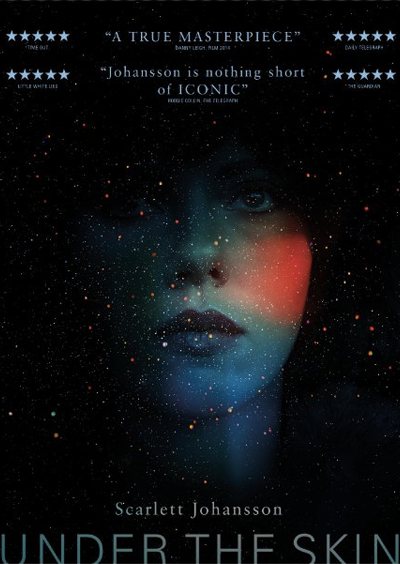
Scarlett Johansson’s colorful face blended in with outer space personifies her character in the film perfectly. [DJ]
The Vanishing (Criterion Collection)
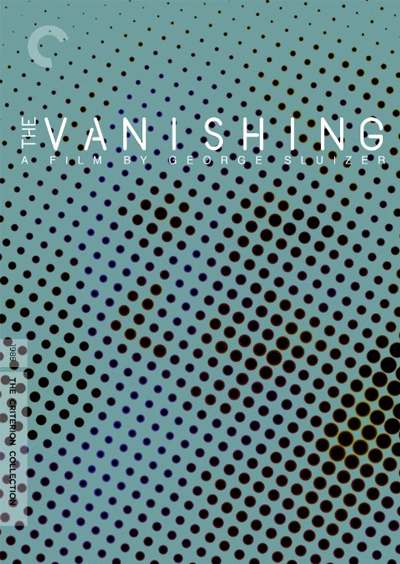
Possibly the most brilliant cover I’ve ever seen, the simplistic design brilliantly reflects the painful frustration of the protagonist as the more you step away the clearer the image becomes. [RS]
Vertigo
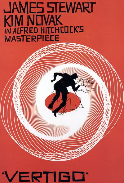
The figures appear to be falling into the vortex of the geometrical downward spiral which symbolizes the meaning of the film’s title. And the imperfect hand lettering of Saul Bass. [DJ]
Videodrome (Criterion Collection)
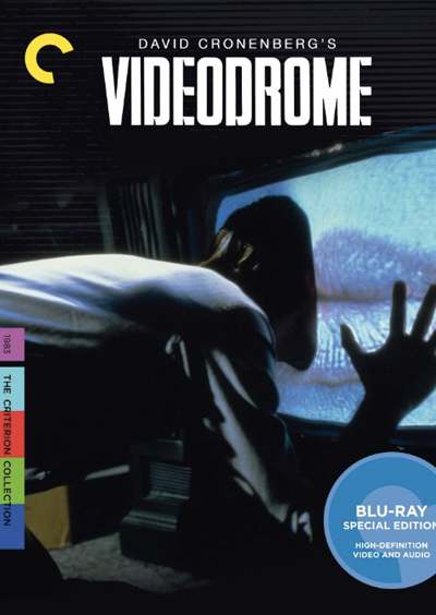
Setting aside the disturbing central image, the color bars in the Criterion bar and the subtle horizontal lines running throughout make this an inspired design. [BB]
We Are Still Here
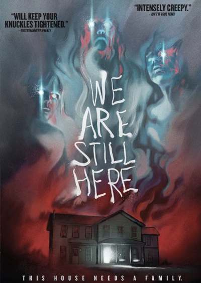
With We Are Still Here, writer-director Ted Geoghegan pays tribute to old-school Italian horror. Its brilliant cover design pays tribute to traditional haunted house films. It’s a damn-near-perfect artistic interpretation. [BH]
Wings of Desire (Criterion Collection)
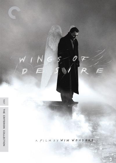
An angel looks down at the world, a well-meaning voyeur, and his gaze shows a fusion of both inquisitiveness and sorrow. [EH]
World on a Wire (Criterion Collection)
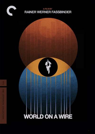
An individual trapped in the center of a sideways cultural venn diagram, unsure of whether the environment surrounding him is the reality he’s used to, or merely a simulation brought forth by the incomprehensible Simulacron. [EH]
Y tu Mama Tambien (Criterion Collection)
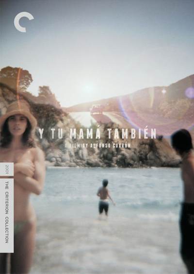
A brilliant composition of blended images meant to look like an old photograph; slighly out of focus, large sun burst, and faded colors. A perfect summer road trip vibe. [DJ]
You’re Next
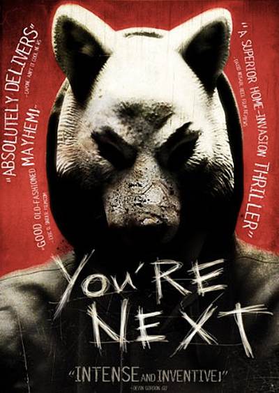
Even the pull quotes are aesthetically pleasing on the You’re Next home video cover, which is as aggressive and in-your-face as the home invasion masterpiece. [BH]
Zodiac (Director’s cut)
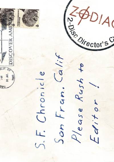
I’m a sucker for covers that double as pseudo-props from the movie like this Zodiac letter addressed to the San Francisco Chronicle. [RS]
Zazie dans le métro (Criterion Collection)
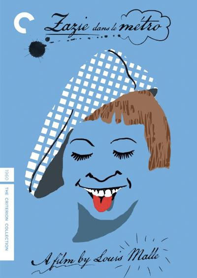
A clean, flat design which visually expresses the zany and cartoonish main character. [DJ]
